How to Display Your Pictures
You invest so much into your photos, time, money, patience (haha!) Your photos deserve to be on display! Every client that walks through my doors ends their time with me by receiving high quality professional prints and products. Yep. Every. Single. Client. I've worked prints and products into every package I offer. I want you to see your photos, enjoy them, and I want them to last.
Often, the task of hanging or finding some way to display your beautiful photos can be daunting. I decided the best plan of attack is to show you my house! I broke up photo displays into 5 categories. Large empty wall, small space, stairs, shelf, and no wall space. From there I'll tell you what I did and what your best way to execute your design is.
1. Large Empty Wall

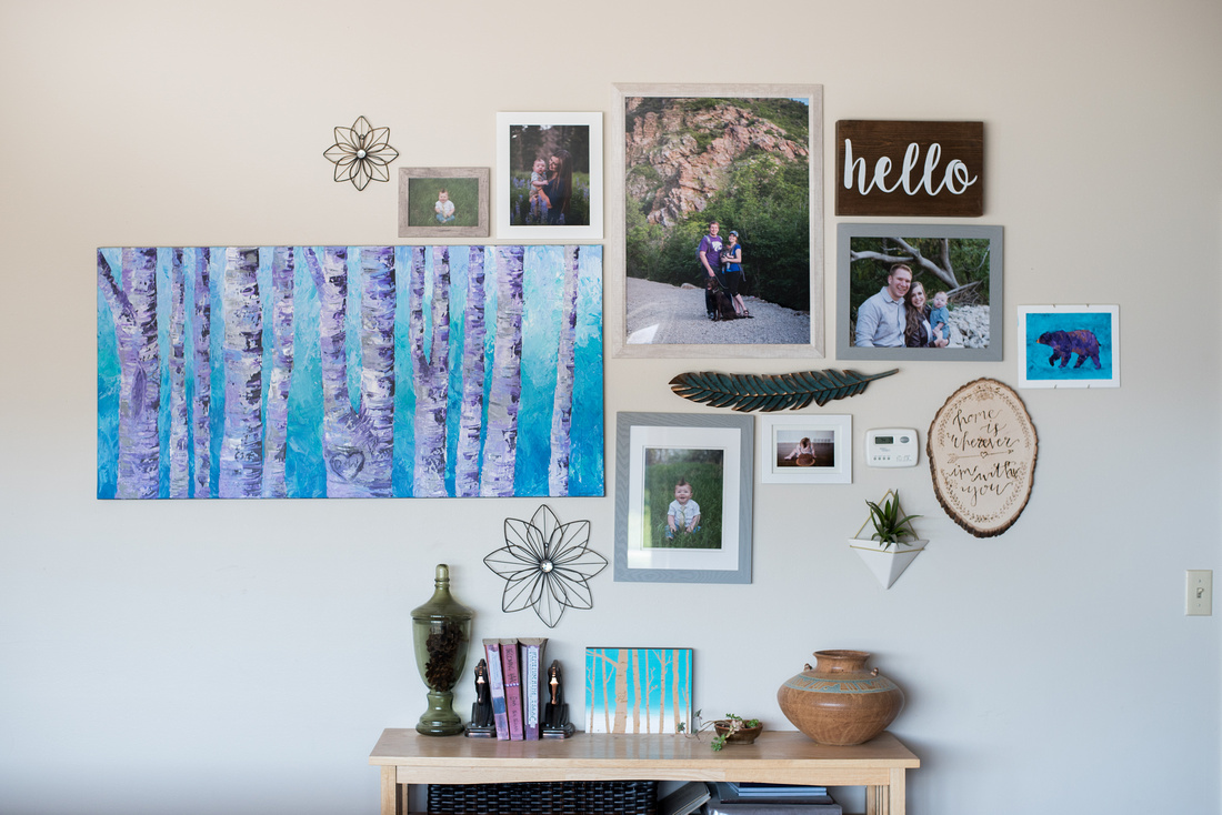
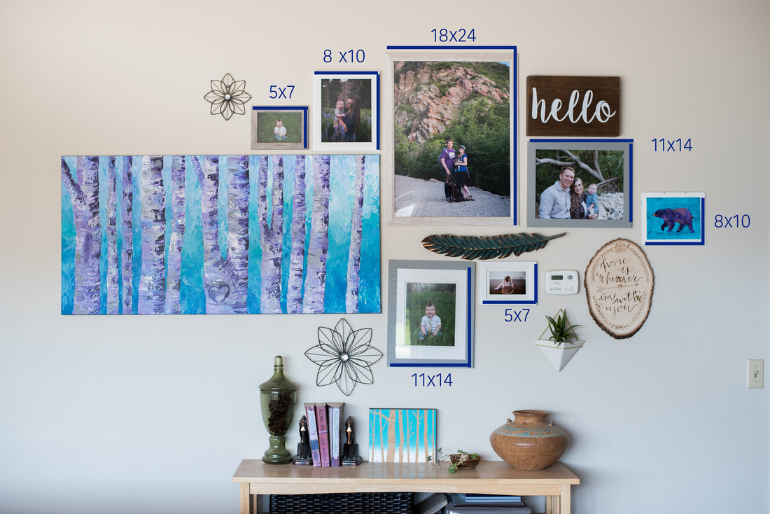
 You can never go wrong with a gallery wall. Only if it's done correctly. This is the first wall you see when you walk into my house. I knew I wanted to make the gallery large and impactful. The first piece I started out with was my acrylic aspen painting. I knew that I wanted this to be a prominent piece to the puzzle. After all - it is one of my favorite paintings I've made! Having it front and center presented the problem of creating a space that lacked flow. Think of designing your gallery like a painting. You want your eyes to naturally flow over the whole piece - not be stuck in a corner somewhere. By placing it off center, I was able to create a balance with smaller pieces to combat how visually heavy the painting is. I'm also a big fan of incorporating non photographic items into my gallery wall, somethings that help balance and give a 3D element such as the wood burned plaque I made, metal feather and flowers and hello sign. A tip I use when creating anything artistic is to squint your eyes. With everything blurry, you'll be able to tell what the dominant piece is. When creating a gallery wall, you don't want one thing to stand out more than the others. When squinting at my gallery wall you are able to see two large shapes; the left side and right side; ideal for this situation. It's also important to understand how sizes look on the wall. I typically try to shy away from anything smaller than an 8x10 - even though I did end up using two, 5x7 frames to fill the space. I added the sizes to the photo below. From there you really get a feel for how small an 8x10 really is.


2. Small Spaces
Often, we don't have the luxury of having large gallery walls in every room (which is probably a good thing! Since repetition can loose the effect you want your gallery wall to portray) Take this weird wall that I have in my basement, for example. It is in-between my office and the playroom. Having a grouping of small pictures would be too busy for the size of space that it was. Instead, I needed to fill the space with a single print that would have a dramatic effect on the space. I decided a metal print would be perfect! I ordered a 16x24 metal print form my lab and hung it up the second it came in. I love what it does for that weird little space and how it just fits perfectly.


3. Stairs
Stairs are always fun to decorate around. For me, I like to mimic the pattern that the stairs make. It's also important when designing the space above your stairs to take account for the viewing space. If you have a narrow hallway, prints larger than 16x20 are going to be hard to see since you don't have ample space to step back to view them. Once again I added a few non photographic pieces to accompany my photographs. By adding the art, but keeping with the frame uniform, it helps complete the space.


4. Shelf
Shelf space is perfect for working in smaller prints. This is in my son's room. I used pictures from his ultrasound, birth announcement, cake smash and a framed print of his footprints as a babe. Shelves allow you to tell a story in a small space. By having all these prints on the shelf, surrounded by books, paintings and toys I'm able to portray just what kind of little boy Jones is.


5. No Wall Space
Sometimes the reality is you simply don't have wall space to display your pictures, or maybe that's not your style. This is where my folio boxes and heirloom albums come in handy. My folio boxes are handmade glass boxes that hold your session in 5x7's. They are the perfect coffee table decoration to have all your photos on display, but in a subtle way. Albums are also an excellent coffee table addition. When they are out in the open, visitors and family members are able to browse your photos at their will. Both are excellent ways to have the most photos on display without sacrificing wall space.


Photos deserve to be on display. They brighten your house and make it yours. I hope this post inspires you to get out your images and find places for them in your home. If you need suggestions or help, feel free to reach out to me! Lets design your dream gallery together!
